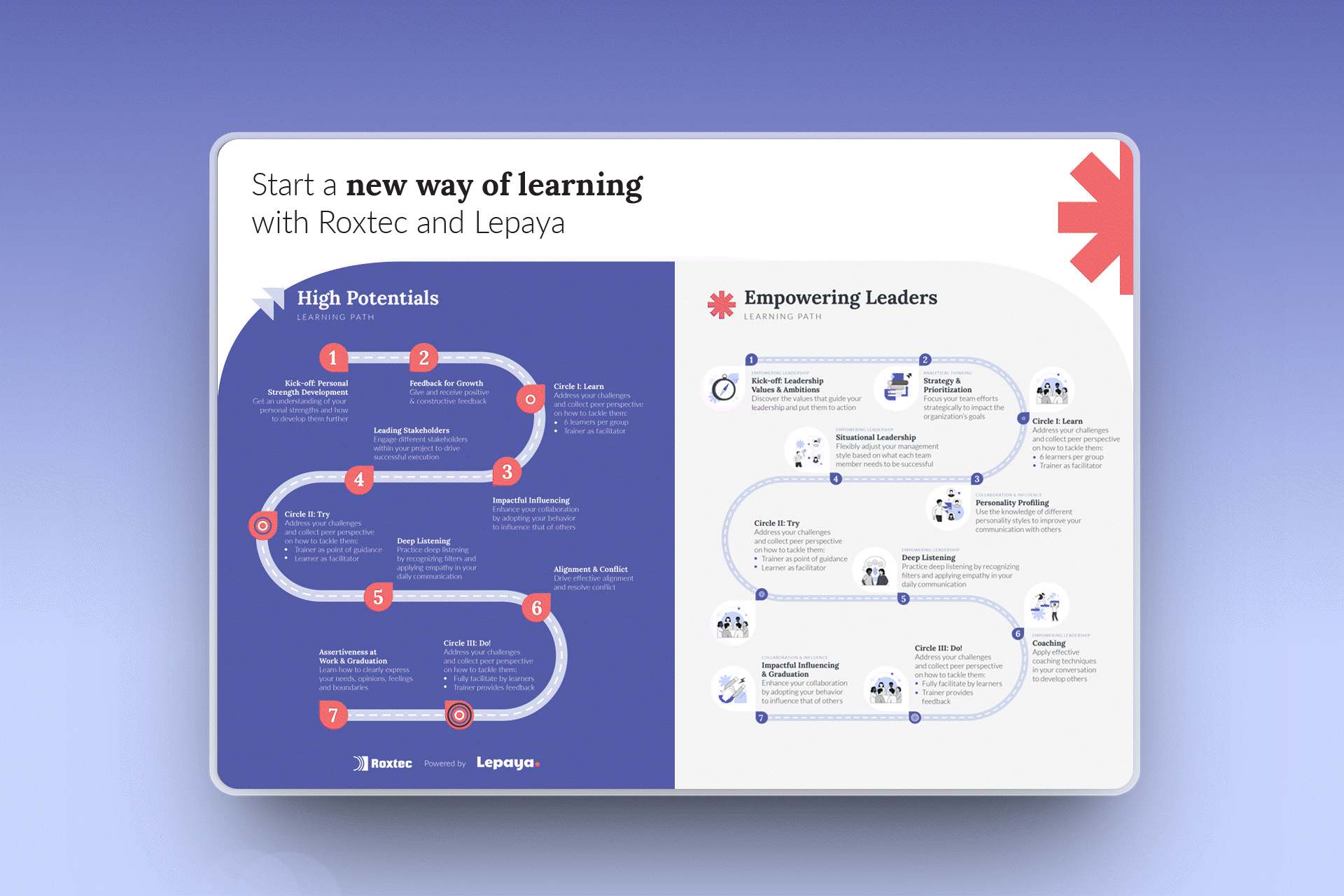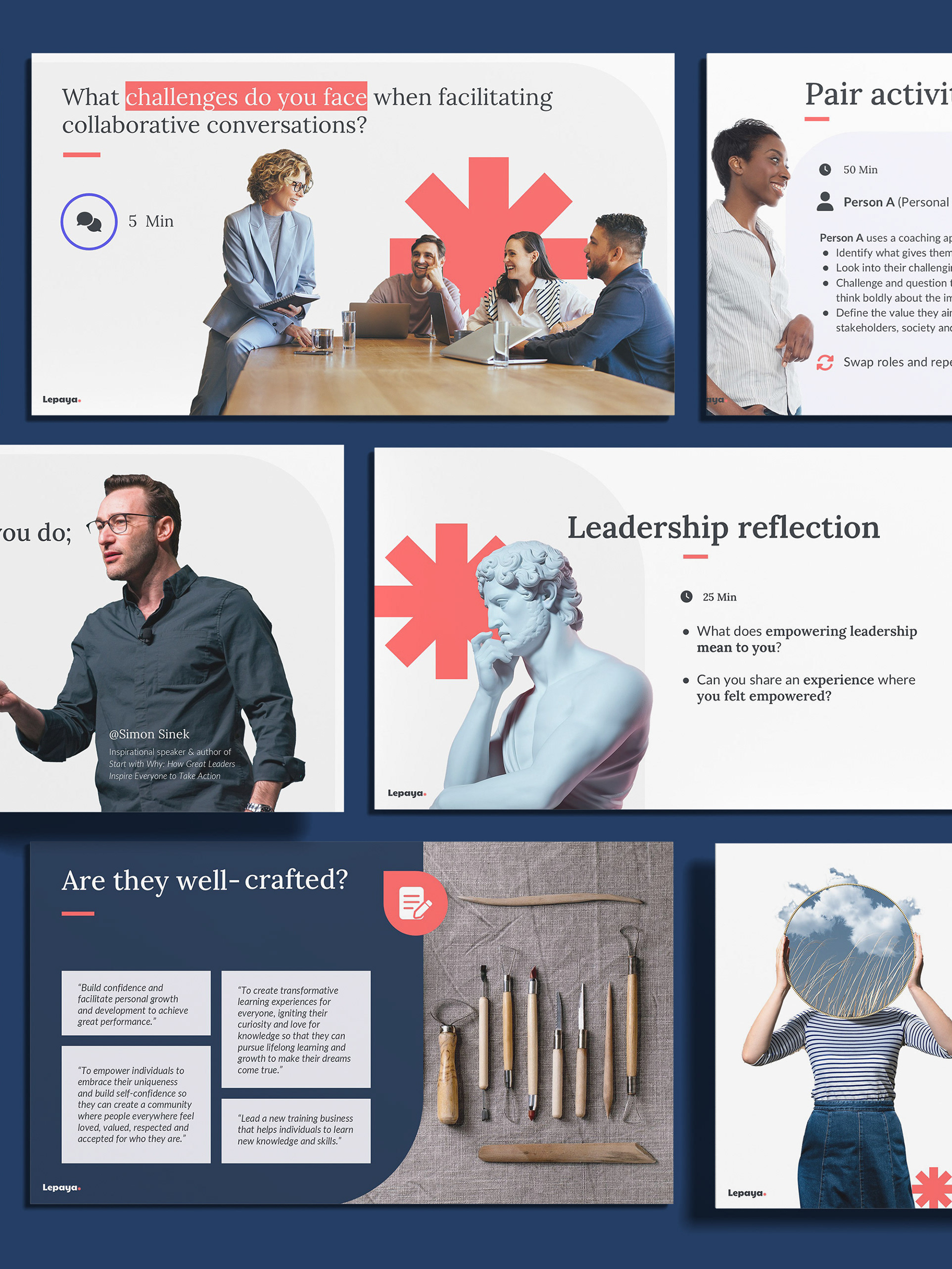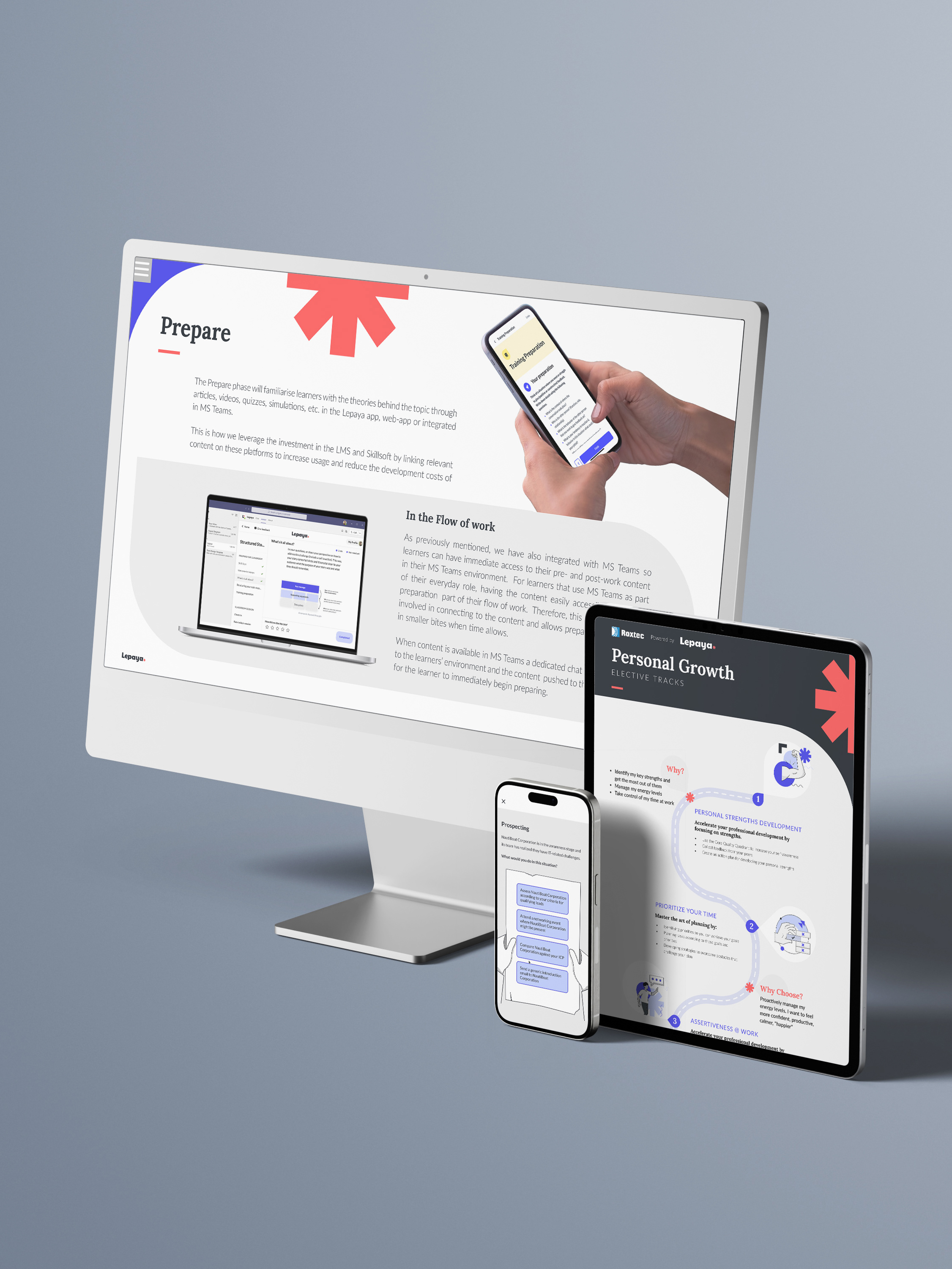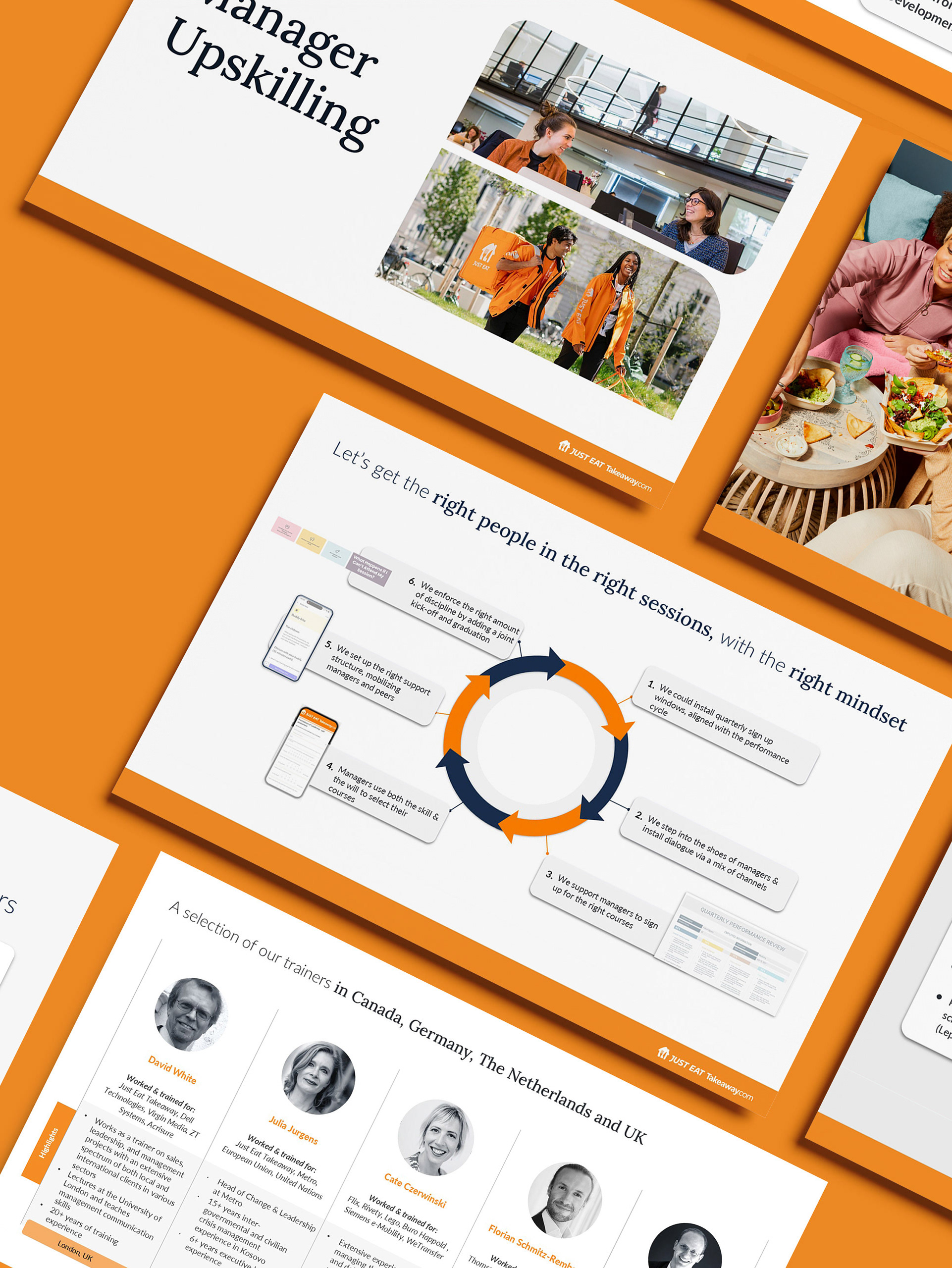
I aim to design clean, editorial-style reports that make complex information easy to understand and visually engaging. From thought-leadership publications to programme overviews and impact reports, I focus on clear hierarchy, strong typography and consistent use of brand colours, imagery and icons. Each layout is built to work seamlessly across digital and print – optimised for screen reading, presentations and high-quality print runs – so the final document feels professional, credible and aligned with your brand.

For me, designing reports is about more than visuals — it’s about understanding each client’s needs and creating tools that support their milestone communication journey. Here’s how I approach the work:
Clarity & Readability: Transform dense content into clear, readable layouts. Create strong visual hierarchy so key messages stand out
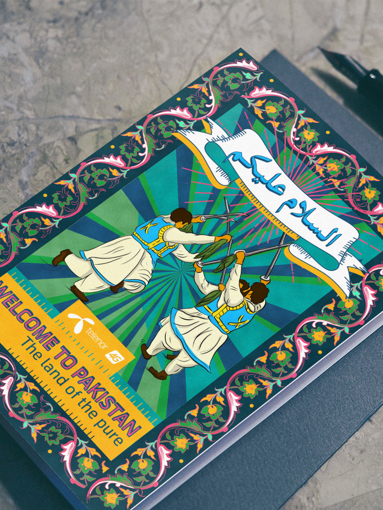
Brand Alignment: Reflect and strengthen each client’s brand through typography, colour and imagery. Maintain a consistent visual language across the full report.
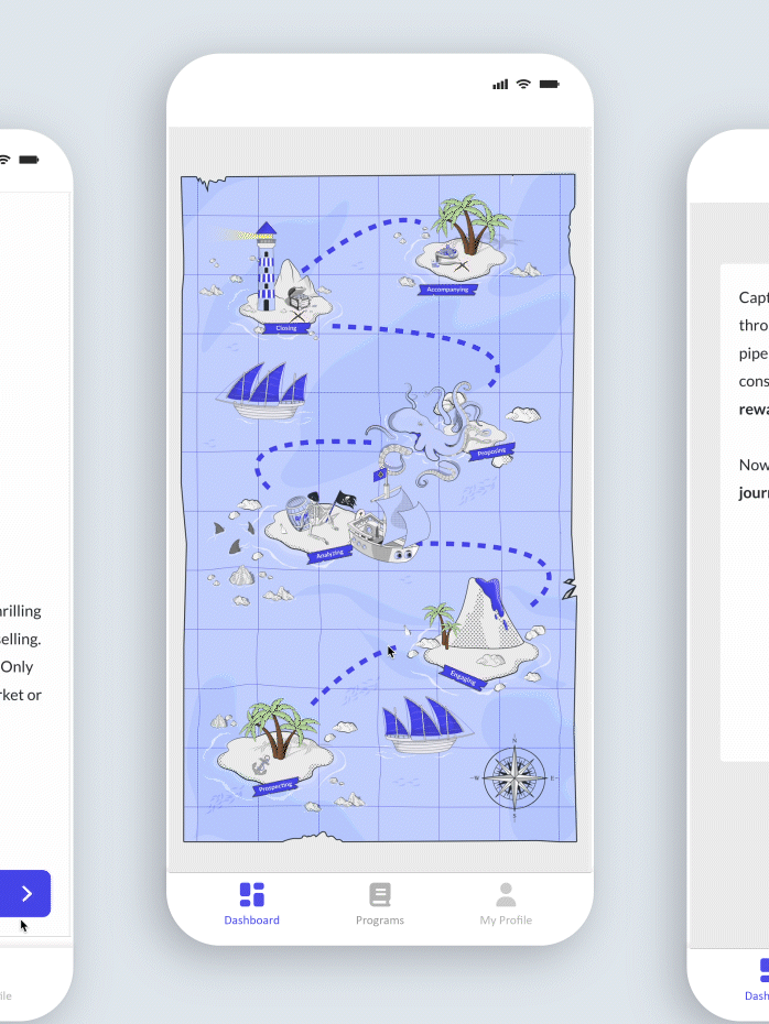
Visual Storytelling: Use data visualisation, icons and photography to support the narrative. Highlight key insights and impact through visuals, not just text.
Flexibility & Structure: Design flexible master pages and grids for multi-page and evolving reports. Make it easy to extend or update the report in future.
Accessibility & Usability: Ensure clarity and accessibility across screens and print. Optimise layouts for comfortable reading and navigation
Delivery & Output: Provide press-ready files for print and web-optimised versions for digital use. Make final assets easy for clients to share, present and repurpose